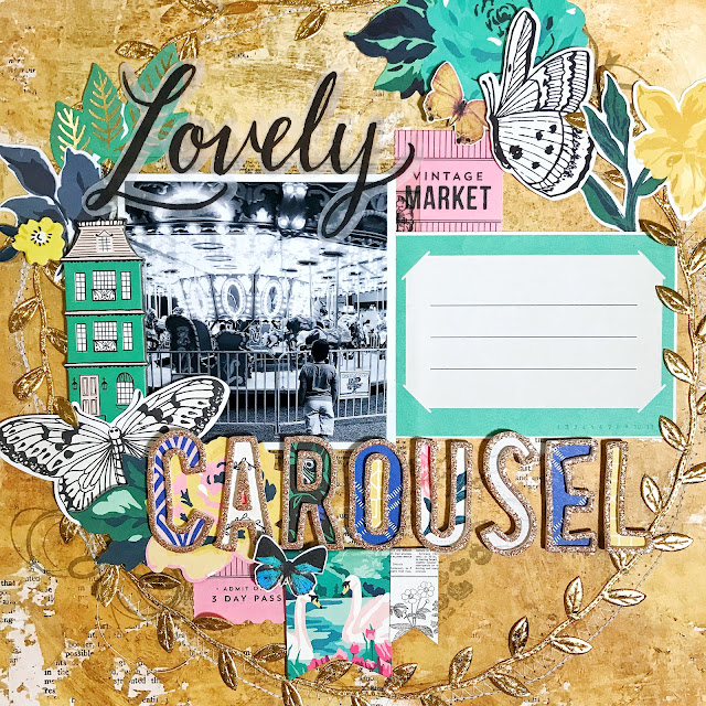
I don't recall ever having done a "wreath" style layout. I was inspired to do so when I saw Lisa's page. I'm glad we're lifting her this month; it has pushed me out of my comfort zone. I think I found a new favorite style.
Using only the Maggie Holmes "Flourish" collection, I started by penciling a circle around the perimeter of the page. It's a good thing I used a pencil, because my circle was more of an oval... lol. I went over that pencil line with my sewing machine and white thread. The thread was too light with the first stitch pattern, so I went back around again using a double stitch and it helped darken more of that white. I then glued down the gold leafy ribbon. This part took longer than all the sewing. I also used background stamps and thread looking stamps to create more texture on the page. The page itself is pretty busy, but I always enjoy adding more dimension.

The problem ended up being that everything was stamped upside down. This is why my layout does not look EXACTLY like Lisa's; which is okay because everyone does interpret things differently. And I could have excluded that fun fact from this blog, but I thought you would appreciate the honesty and the fact that mistakes happen with paper crafters of all levels, and it's during those mistakes that we can learn to pay more attention to things and grow our problem-solving muscles. Overall, mistakes make you better. So how did I solve that "up-side-down" issue? I covered it with embellies... so that you can only see partial stamping.
Lately I've been trying to be more intentional with my journaling... and not so much to discuss what's happening in the photo, but more so to tell a story about my boy at this age. I know exactly where this was and when, I just have to think of something fun or funny that happened in the last month and write it out; this is why I left it blank.
I love the turn out and I love the placement of everything, and I love that I've been backing up my rose gold thickers with pattern paper. This is my favorite technique now a days and you will find it on a few other layout shares soon to come - so stay tuned!
And since we're being honest, this title had an "F" at the end of it. "Carouself"... I think it would've worked if I hadn't added "Lovely" at the top. But I felt "Lovely" was more needed. I wanted the title to be silly & punny (as an homage to Lisa), but because the layout is such an elegant design, I didn't think it was fitting. So I ripped it off.... it left a tiny white mark; which - again - is fine, because the patterned paper itself is patchy. We'll call that mistake #17 - there's others not mentioned here today. lol.
Come join the Scraplift challenge this week. And if you're in need of new supplies, you can visit the shop HERE. And use my discount code "Damaris" to save 20% off of your entire purchase. And when you are done shopping, visit the PI Friends & Fans Facebook Group to share your projects.

Using only the Maggie Holmes "Flourish" collection, I started by penciling a circle around the perimeter of the page. It's a good thing I used a pencil, because my circle was more of an oval... lol. I went over that pencil line with my sewing machine and white thread. The thread was too light with the first stitch pattern, so I went back around again using a double stitch and it helped darken more of that white. I then glued down the gold leafy ribbon. This part took longer than all the sewing. I also used background stamps and thread looking stamps to create more texture on the page. The page itself is pretty busy, but I always enjoy adding more dimension.

The problem ended up being that everything was stamped upside down. This is why my layout does not look EXACTLY like Lisa's; which is okay because everyone does interpret things differently. And I could have excluded that fun fact from this blog, but I thought you would appreciate the honesty and the fact that mistakes happen with paper crafters of all levels, and it's during those mistakes that we can learn to pay more attention to things and grow our problem-solving muscles. Overall, mistakes make you better. So how did I solve that "up-side-down" issue? I covered it with embellies... so that you can only see partial stamping.
Lately I've been trying to be more intentional with my journaling... and not so much to discuss what's happening in the photo, but more so to tell a story about my boy at this age. I know exactly where this was and when, I just have to think of something fun or funny that happened in the last month and write it out; this is why I left it blank.
I love the turn out and I love the placement of everything, and I love that I've been backing up my rose gold thickers with pattern paper. This is my favorite technique now a days and you will find it on a few other layout shares soon to come - so stay tuned!
And since we're being honest, this title had an "F" at the end of it. "Carouself"... I think it would've worked if I hadn't added "Lovely" at the top. But I felt "Lovely" was more needed. I wanted the title to be silly & punny (as an homage to Lisa), but because the layout is such an elegant design, I didn't think it was fitting. So I ripped it off.... it left a tiny white mark; which - again - is fine, because the patterned paper itself is patchy. We'll call that mistake #17 - there's others not mentioned here today. lol.
Come join the Scraplift challenge this week. And if you're in need of new supplies, you can visit the shop HERE. And use my discount code "Damaris" to save 20% off of your entire purchase. And when you are done shopping, visit the PI Friends & Fans Facebook Group to share your projects.


No comments
Post a Comment